
SEO or Human Headlines?
Unfortunately, there isn’t an easy answer for this question. The best solution is to keep it as simple as possible. There’s evidence that five words or less in your main headline is the answer. There’s also evidence (from Father Ogilvy) that 6-12 words is the ideal length for your header. The answer will fall upon you and your SEO specialist A/B testing different headlines over a given period of time. Overall, your homepage headline should be a targeted, benefit-oriented statement that diffuses what you can do for the potential customer.

The first phrase you see on Modern-Aviation.com is the keyword "FBO Services". The smaller subheads provide descriptive detail.
My informed opinion would be to, like I said, keep it simple – and make it the last element of your website you write. Once you’ve completed homepage copy, and even service or product copy, you’ll have a much better grasp on which keywords you should be targeting.
Here’s a copywriting exercise: Boil down your company to its most important offering and use that.
-
- SEO Agency: Improving Digital Search Presence
Next, think of your target audience, and try to work them in somewhere.
-
- Improving Digital Search Presence for Corporations, Businesses, Startups
Finally (if you’re feeling saucy), add some form of emotional modifier, whether it’s inspiring, straightforward or even grassroots.
-
- Improving Digital Search Presence for Worldwide Corporations
- Improving Digital Search Presence for Forward-Thinking Businesses
- Improving Digital Search Presence for Bootstrap Startups
You don’t have much time to grab the user’s attention – about eight seconds – so explaining your core offering while striking a particular emotion within 5-12 words is key to getting them deeper into your site.
Homepage Messaging
Compiling the proper message on your homepage is key to high engagement and a low bounce rate. In order to be successful at properly communicating your brand’s message, you need to understand the inherent benefit(s) you provide to your target market. There isn’t another place within your website where properly presenting your UVPs will be as important (remember our content marketing best practice, “Knowing the Value of USP/UVPs”).
Your main benefit should be communicated in the first headline that they see. Answer the question that the consumer is wondering – “What can you do for me?” Make sure to pepper in the remaining UVPs within the body copy or within subheaders. While text and how you communicate copy is certainly important, let’s not completely disregard colors and imagery when trying to communicate a message on your homepage.
Imagery + Color
As the previous section describes, imagery and color are very important concepts on a website, and often the most compelling aspect when motivating the user to purchase. Let’s start with color.
There are marketing know-it-alls out there that will tell you that red, green and other colors evoke certain emotions. While it’s true that colors are associated with evoking emotion in the broad sense, it’s not that cut and dry.
As research shows, it’s likely because elements such as personal preference, experiences, upbringing, cultural differences, context, etc., often muddy the effect individual colors have on us. So the idea that colors such as yellow or purple are able to evoke some sort of hyper-specific emotion is about as accurate as your standard tarot card reading.
Emotive responses to color are simply too dependent upon personal experiences to just slap a color on a website and say, “Now the consumer feels happy about our brand!”
But that’s not to say you shouldn’t care about the color scheme of your brand – in fact, that’s one of your most powerful tools in your branding toolbox for making a memorable website. In fact, results from studies such as The Interactive Effects of Colors show that the relationship between brands and color depends upon the perceived appropriateness of the color being used for the particular brand – Ask yourself, “Does the color “fit” what is being sold?”
An attractive, neutral and minimal color scheme that gives off a luxurious vibe — works great for a variety of business categories.
Now let’s talk about imagery. The type of pictures and iconography (even video) you use will depend on your brand tone.
Let me start by saying, avoid the cliche, overused, business stock photos. You know what I’m talking about, a group of people gathered around a computer running Windows 95, pointing and laughing at something dreadfully hilarious. Or the smiling woman wearing a headset, talking to the funniest complaining consumer on the planet. Or worse – those little blob-people that are just standing in a matrix-like room. You can do better than that.

Blue Goose Photo Booth in Richfield, MN places their product/service front and center.
If you’re a little strapped for cash, there are tons of websites popping up that offer free stock images that challenge the status quo: Best Free Stock Photo Sites on the Internet
Secondary Messaging
You have your primary message, which should consist of one core competitive, inherently useful benefit that speaks to a designated target – but you should also provide the secondary message. This includes additional messages that encourage the users to take certain steps. This should normally come in the form of a CTA. So, if you’re headline says, “Vacuums for Less”, your CTA should support that statement with something like, “Our Warranted Remanufactured Vacuums are more Affordable & Just as Reliable – “LEARN WHY!””
How to Write a CTA
Circling back to our conversation about color – there are huge debates about CTA color in the digital marketing industry. Common sense would tell you to color your CTAs green – it’s associated with ‘go’ at a stoplight, whereas red is associated with ‘stop’. But, as this ConversionXL article shows, red actually converts better in almost every case study (but, of course not all). So, there must be more at play than color psychology.
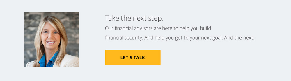
From this financial advisor website, you can see that they're invoking a sense of trust, calm and helpfulness.
It’s all about the button and the language. Giving the user something fun to click paired with fun actionable verbiage – “Buy Now!” “Add to Cart!” “Get Exclusive Access!” – is what seals the deal. Also, among other things, it’s been shown through a HubSpot study that CTAs with numbers perform better than those without. So what else should your CTA consist of?
According to HubSpot, there are several tips to consider:
-
- Start with Subjects & Verbs
- Include Numbers
- Use Adverbs Sparingly
- Keep it Concise – a Length of 90-150 Characters
- Be Less Technical and More Practical
Check out the Slideshare below for more information.
5 Tips On Writing Compelling Call-to-Action Copy from HubSpot
Help Visitors Find What They’re Already Looking For
A point that I’ll drive home – become familiar with analytics, or team up with an analytics person to better understand where your website succeeds and where it fails. All of this talk about proper messaging on your homepage means nothing if you’re not looking at the performance data.
To help yourself help your visitors, you have to understand two Analytics reports called ”User Flow” and “Behavior Flow”. These are a feature in Google Analytics that shows the path of your visitors and the way they navigate content, and are crucial to awesome brand SEO.
These reports show how people enter into your site, on which page they land, and to which pages they navigate. If you’re getting a huge drop off of visitors from your homepage, you know that something is askew. Or if people are navigating directly to your contact page, that tells you something (homepage messaging, perhaps?) is working.
The main difference with Behavior Flow is that you can switch between Visitor Flow and Event Flow within one report and you can now see Events and Pageviews within one flow. This is a big deal if event tracking is an important part of your tracking strategy. User flow provides more high-level, user-oriented (country, operating system, etc.) data.
A great behavior flow would go like this:
-
- A user lands on a blog from organic search.
- A user is presented with a ‘related article’ carousel when they finish the blog.
- They click on the other blog and read it.
- The user loves the content so much that when a pop-over appears on the second blog, she provides her email for a newsletter.
Of course, this isn’t a perfect world, so you won’t always have perfect interactions, but you will never improve your digital marketing efforts if you’re not constantly analyzing the way users move through and interact with your site and content.
Navigation
Site navigation is more crucial most people consider it to be – and it has a lot to do with determining or modifying appropriate user/behavior flow. Consider implementing these navigation bar best practices into your content marketing strategy:
Location of Navbar
Users expect to find a horizontal navigation bar across the very top of your web pages, although more and more web designers are experimenting with different placement — sometimes it's nice to stand out from competitor websites — just make sure it's tastefully done.
Drop Down Menus
If you’re running an ecommerce store, it might be your first instinct to have a ‘Products’ tab with a drop down featuring major categories of products. Unfortunately, these have been proven bad strategies for two main reasons: they’re outdated, they’re tough to use on mobile devices, they’re difficult to crawl (unless they’re in HTML) – and they’re just plain annoying in terms of usability.
If you have a drop down, you’re encouraging users to skip the important top-tier pages. The problem is that the human eye is quicker than the mouse – meaning the user has already decided what they want to click. When the drop down is introduced, it creates resistance between the information presented and the desired action. We want the user to take an optimized path and not get confused in the process.
Remedies for replacing the drop down include using a filter or search bar, back and forward navigation buttons, vertical linking, horizontal linking and similar pages aggregation.
Short Term Memory + Attention Span
Similar to the drop down fiasco is the navigation bar that gives way too many options. Short-term memory holds only seven items at a time. If you keep it short and simple, your visitors are much less likely to pass over crucial items. Limiting options gives the users fewer steps in their path to purchase.
Serial Positions Effect
Based on the psychology principles of primacy and recency, studies show us that a person’s attention and retention capabilities raise when recalling items that appear at the beginning and the end of a list. Think of a grocery list. It may be easy to recall the first few items you write down and perhaps the last couple. But if you’ve got a dozen items on there, you won’t remember everything in between. Same with your navigation bar – put your most important items at the beginning (home, about, products) and the end (contact).
Navigation Phrasing
The way you phrase the navigation items is wide-open, just don’t try and reinvent the wheel. Determine why people are coming to your site – what keywords are they using? If people are entering your site through certain pages, should those be top level? Are people exiting your site through these same pages?
Action
Action-based navigation phrasing uses dynamic, normally verb-only categories, like "Learn" for a blog section for example. This gives the user a little encouragement when choosing where to direct their mouse.
The companies that will benefit most from an action-based navigation are those that have websites where visitors come with a specific action in mind. For instance, those that go to Charles Schwab are there to do banking, trading, managing their wealth, reviewing a portfolio or searching for insights.
Audience
Audience-based navigation phrasing is best left for those organizations that could have multiple streams of target audiences and you want to direct them to relevant information.
Object
Object-based navigation phrasing uses concrete, normally noun-only categories. This gives the navigation a ‘table of contents’ feel.

DKY Agency in South Minneapolis uses a good mix of navigational phrasing
Mastering The Art of SEO Copywriting
When it comes to building the best possible copy for your homepage, experimenting with a mixture of creative phrasing around SEO keywords will help you uncover what works best within your industry. The good news is that there are a ton of resources out there that will help you learn more about the art of SEO copywriting. Take a look at some articles below for further reading.
When it comes to homepage copy, perfection pays off.
The team at Frahm Digital develops results-driven content marketing strategies that increase conversions. Whether you need to target new audiences with keyword implementation, craft more creative headlines or write digital advertisements, we can help.
If you're interested in learning what it's like to work with us, click the button below to receive a no-hassle, 100% free website audit. We'll give you actionable insights on ways to improve your communication, design and SEO.